KAM
Full rebranding for a company that handles natural stone processing
.png)
Timeless
Design
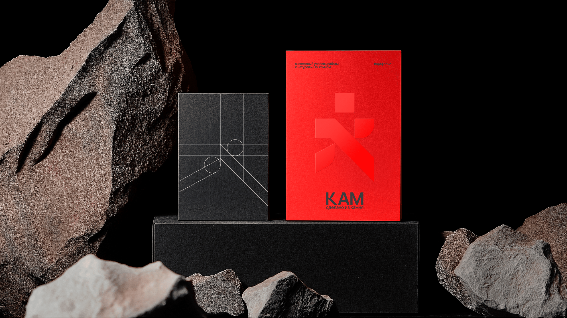
The KAM rebranding modernized the company’s identity while honoring its roots in natural stone.
I began by analyzing KAM’s core values and market positioning, focusing on their expertise in processing natural stone and creating high-quality stone products. The goal was to modernize their brand identity while preserving its essence and connection to the natural materials they work with.
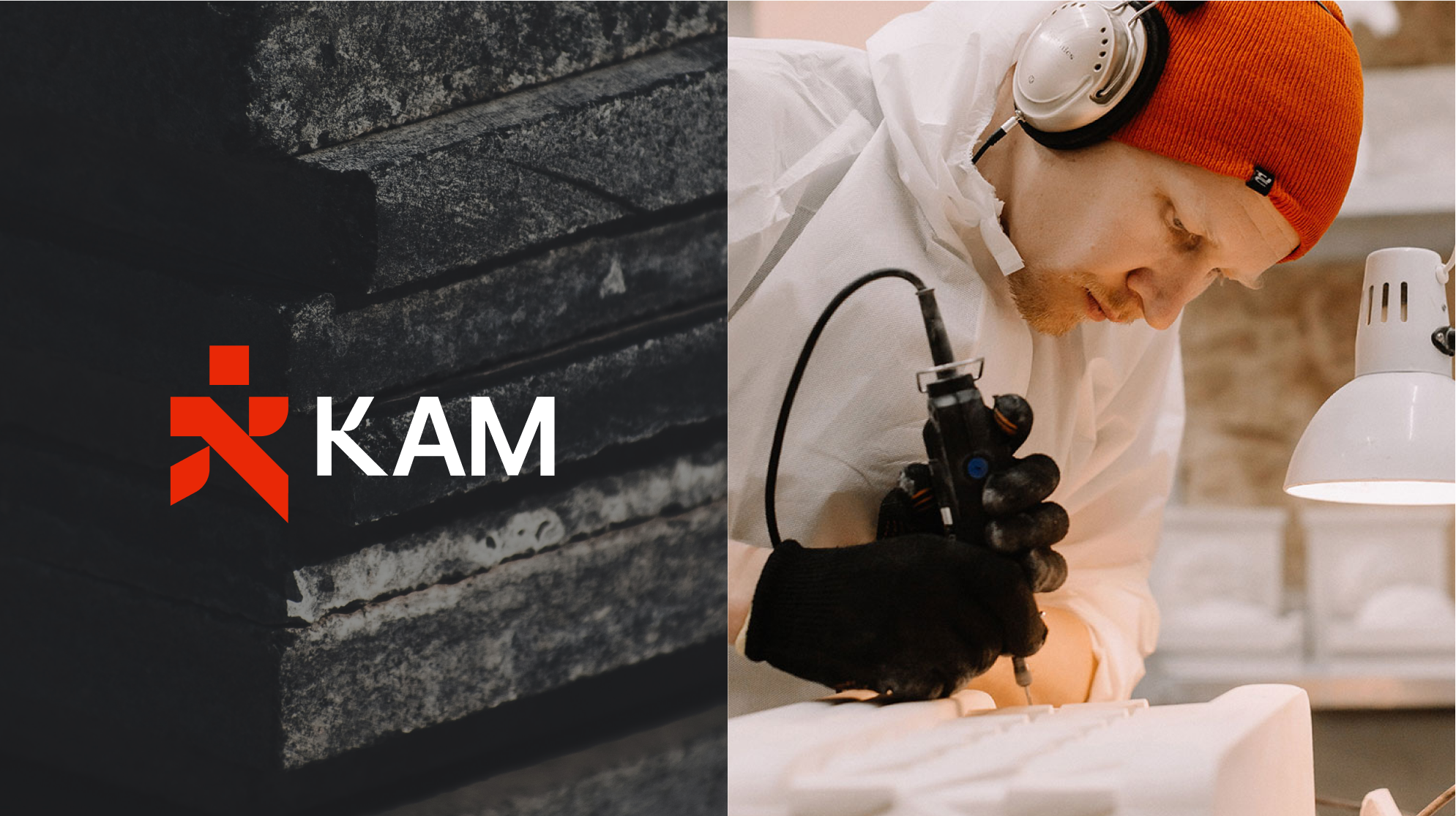
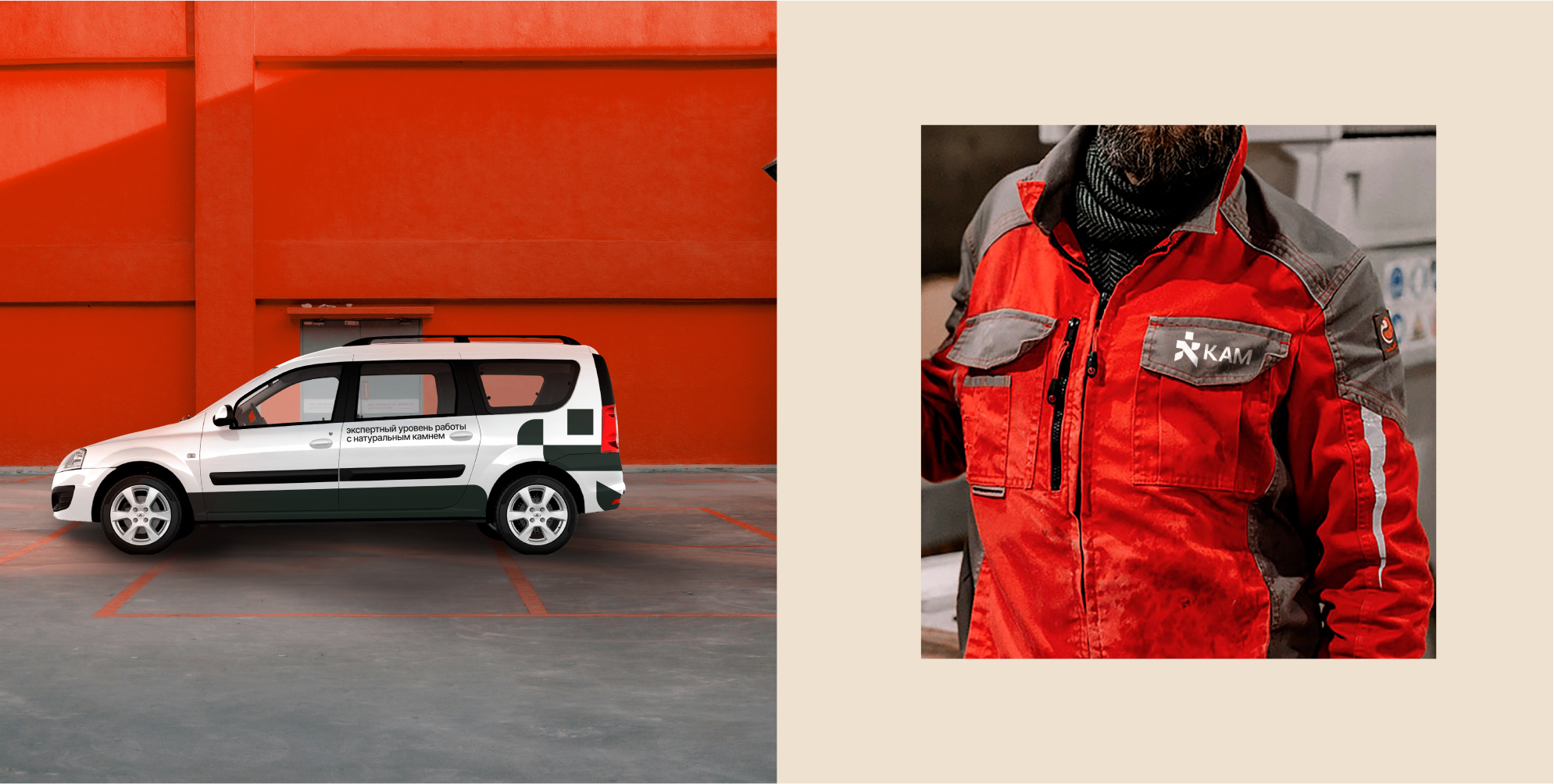
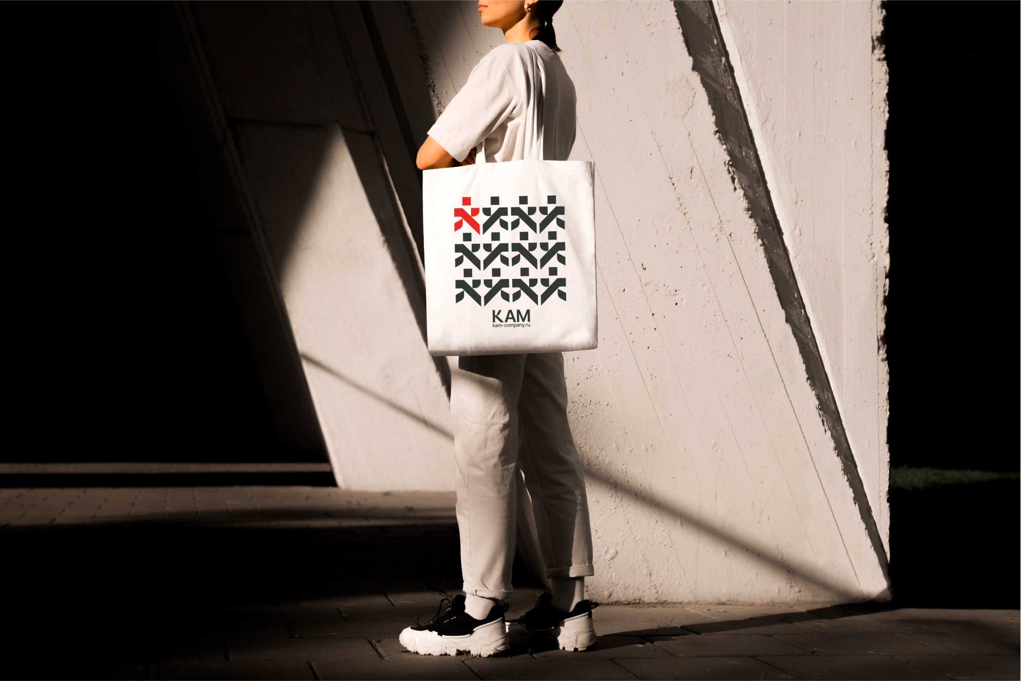
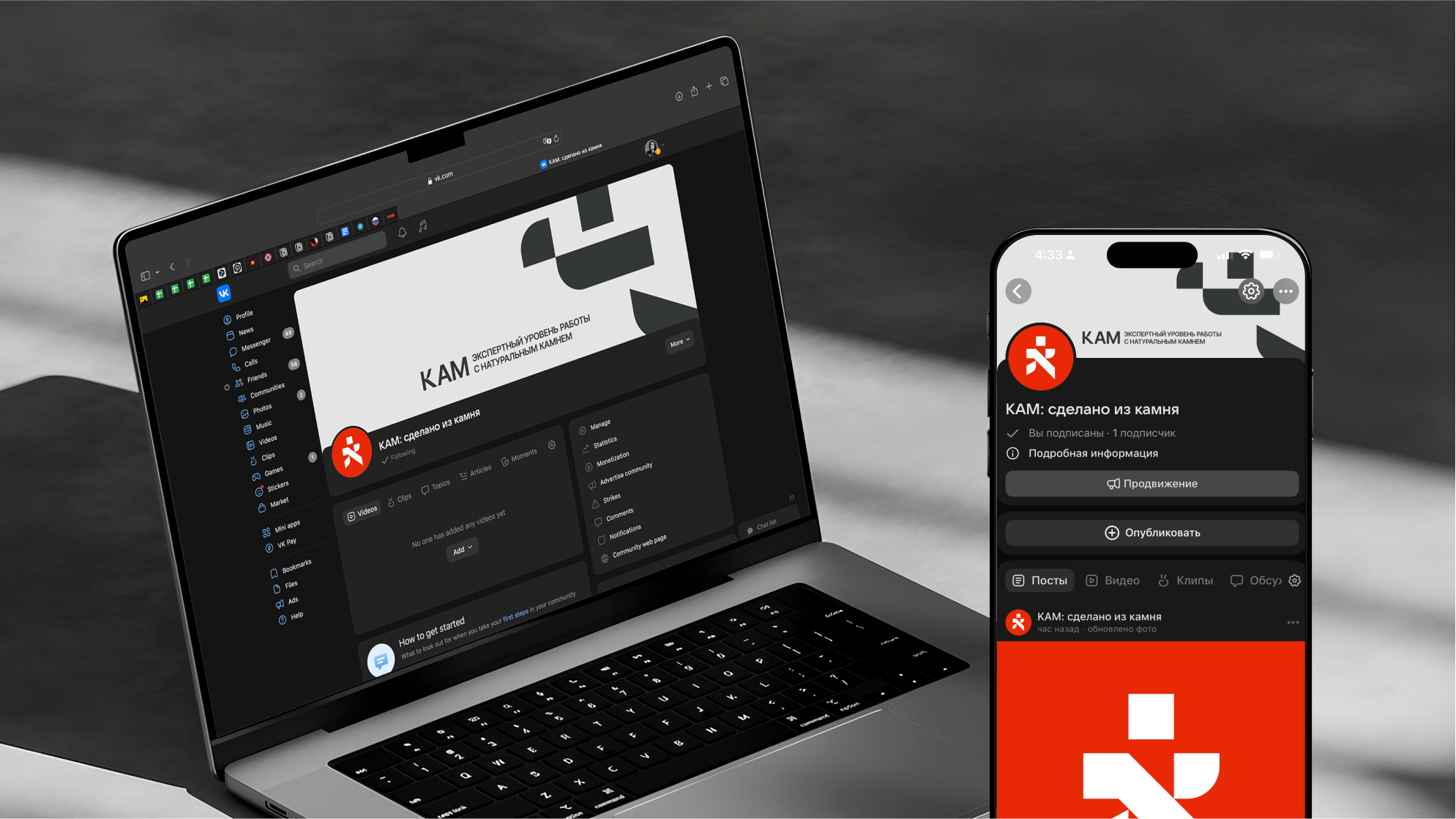
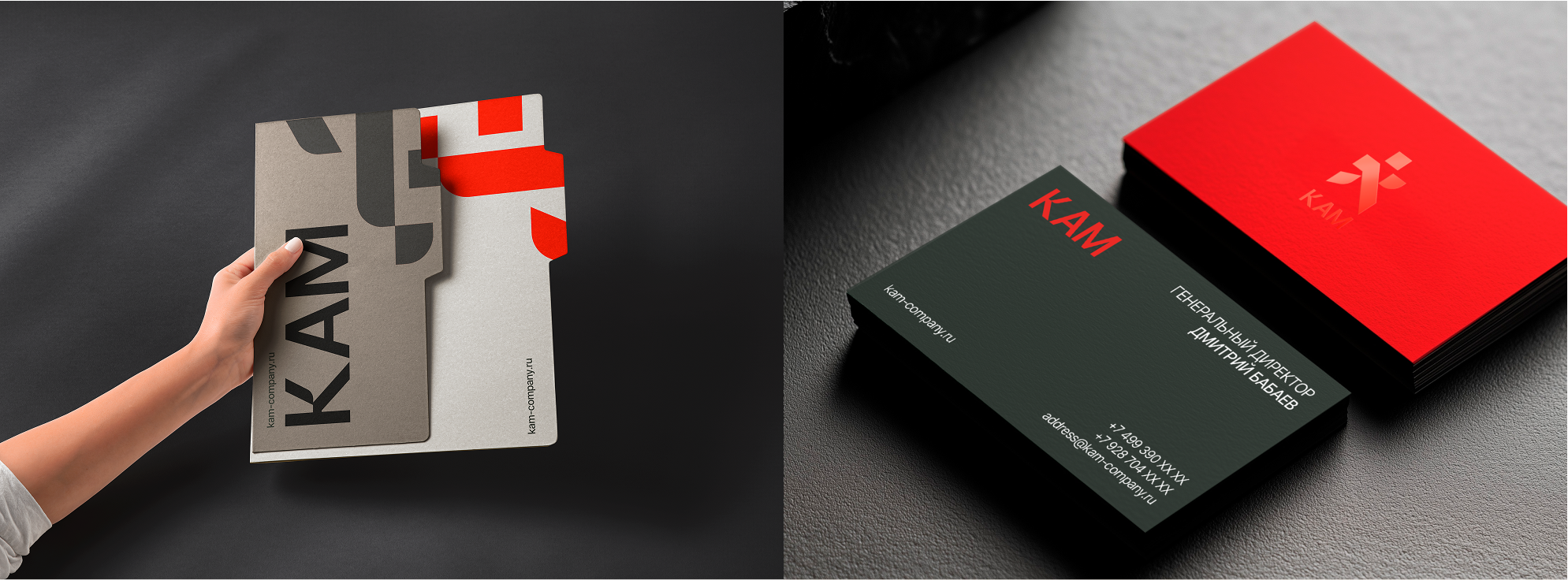
The updated logo retains the iconic figure of a person moving forward, symbolizing progress and ambition. However, I reimagined it with a stone-like forms, emphasizing the company’s focus on natural stone and craftsmanship. This subtle yet powerful change bridges tradition and modernity, reflecting KAM’s commitment to innovation while staying true to its roots.
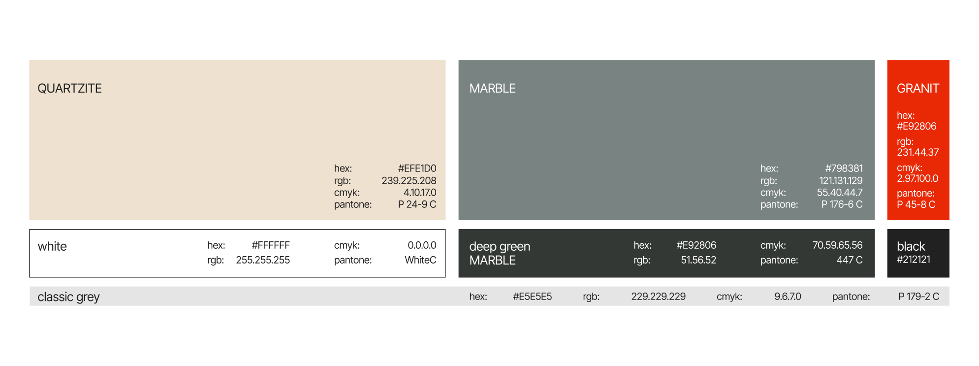
For the color palette, I drew inspiration from the natural beauty of stone. Deep gray and greenish marble tones evoke harmony, stability, and reliability, while red-orange granite accents add warmth and energy, creating a striking visual contrast. Light quartzite tones bring a touch of elegance and nobility, completing the palette. Together, these colors not only highlight the unique shades of natural stone but also convey the durability, strength, and timelessness of KAM’s products.