HANOI HACKING WEEK
A small visual style for a hacker event
STRONG
DESIGN
For Hanoi Hacking Week, we created a vibrant brand identity inspired by Hanoi’s iconic landmarks and the energy of innovation.
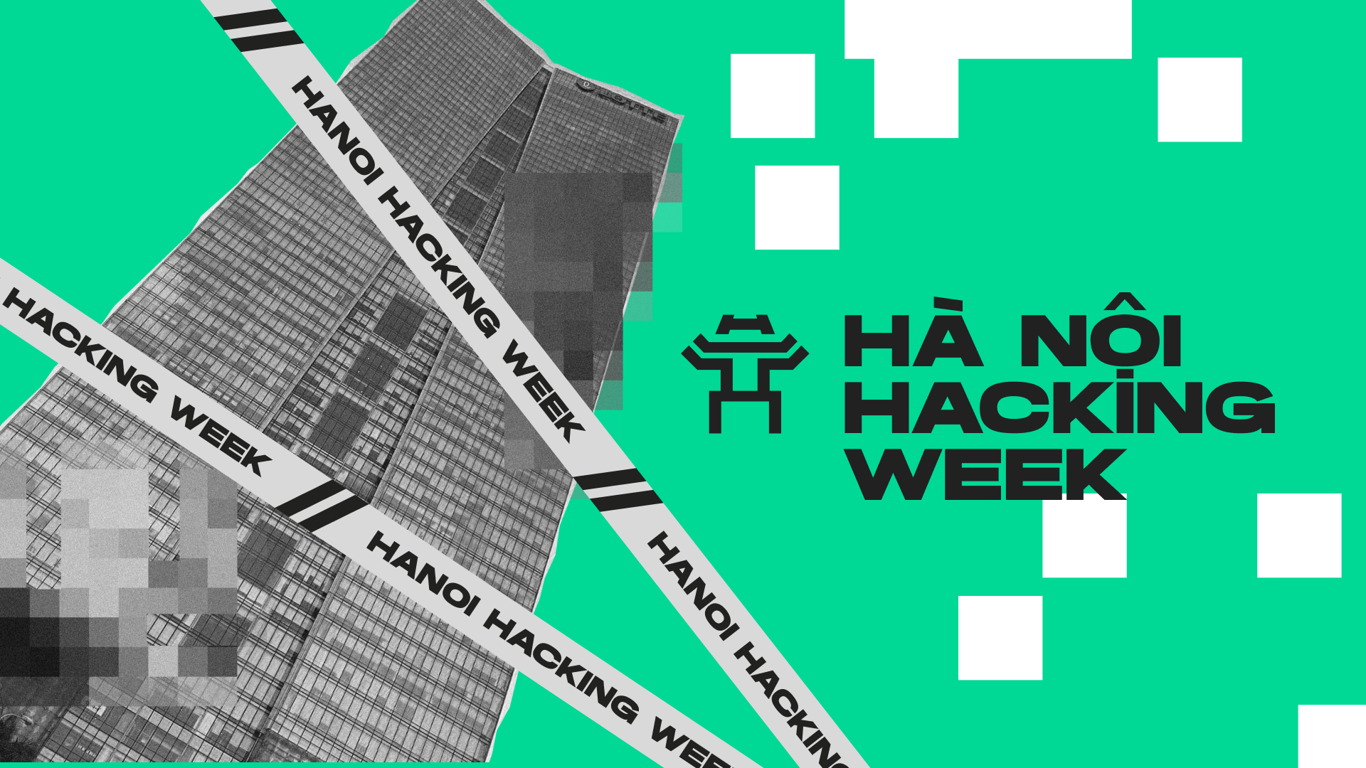
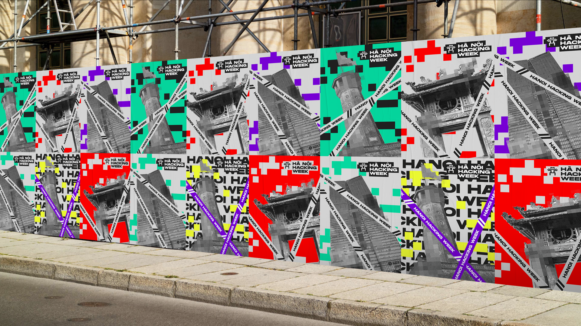
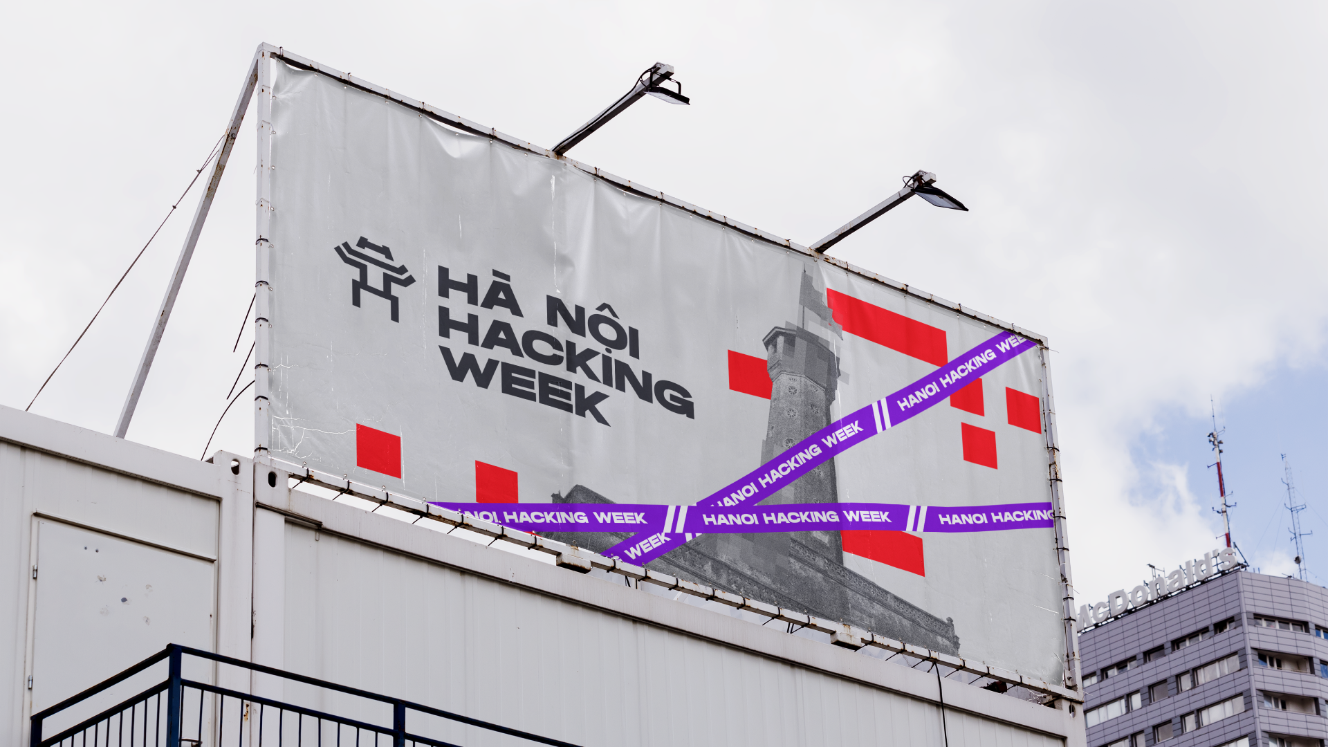
The Hanoi Hacking Week project involved creating a dynamic and engaging brand identity for a tech event in Hanoi. The goal was to capture the energy of the city while reflecting the cutting-edge nature of the hacking community.
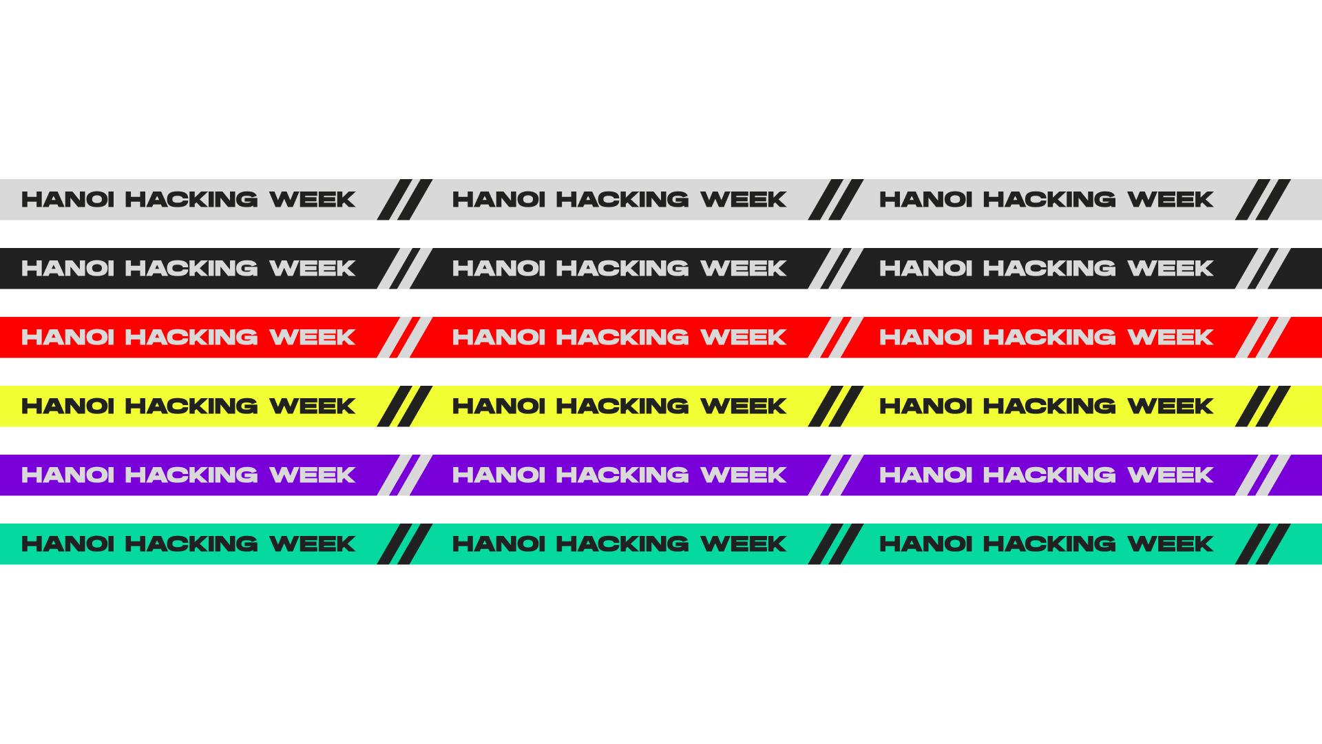
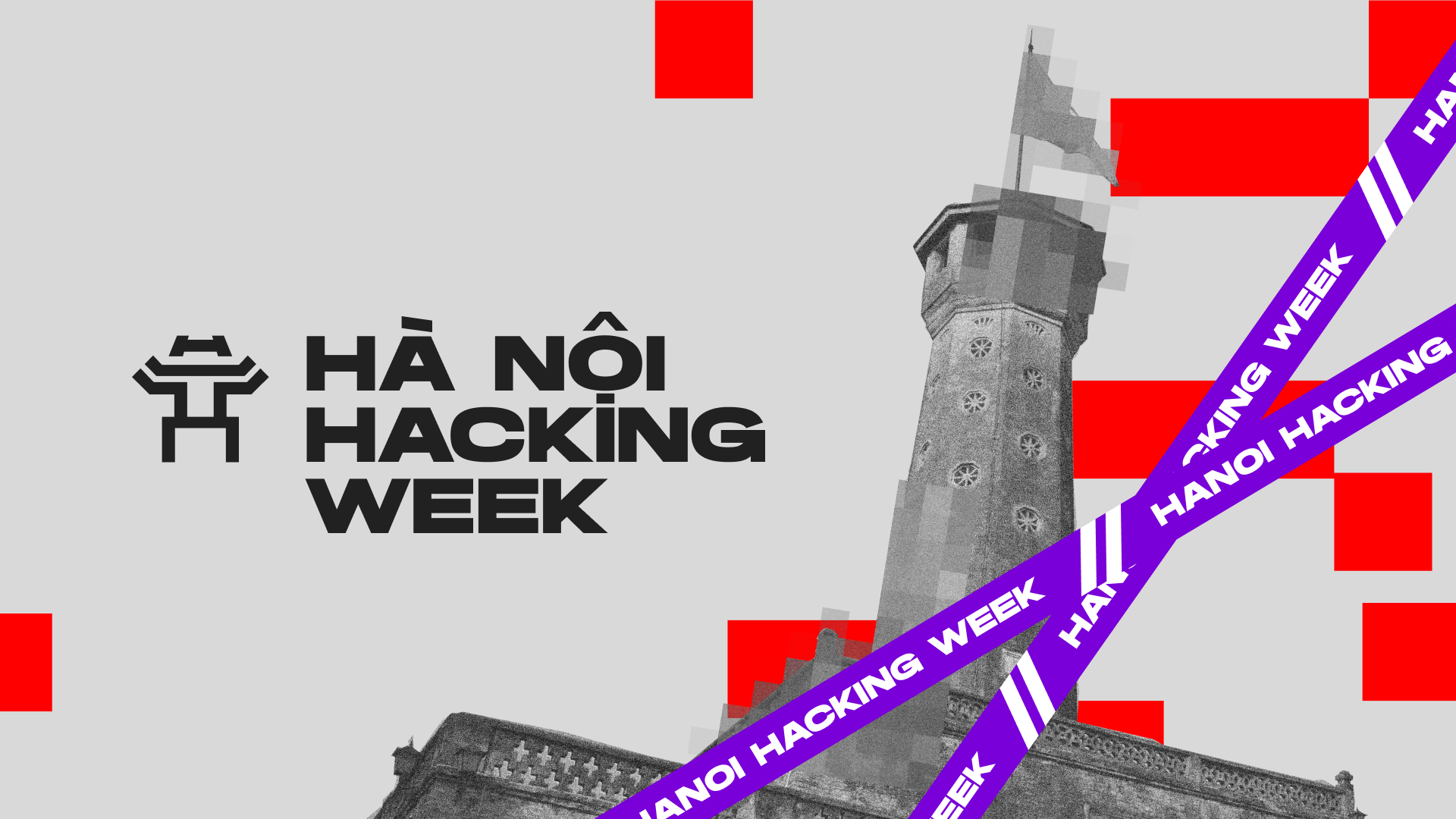
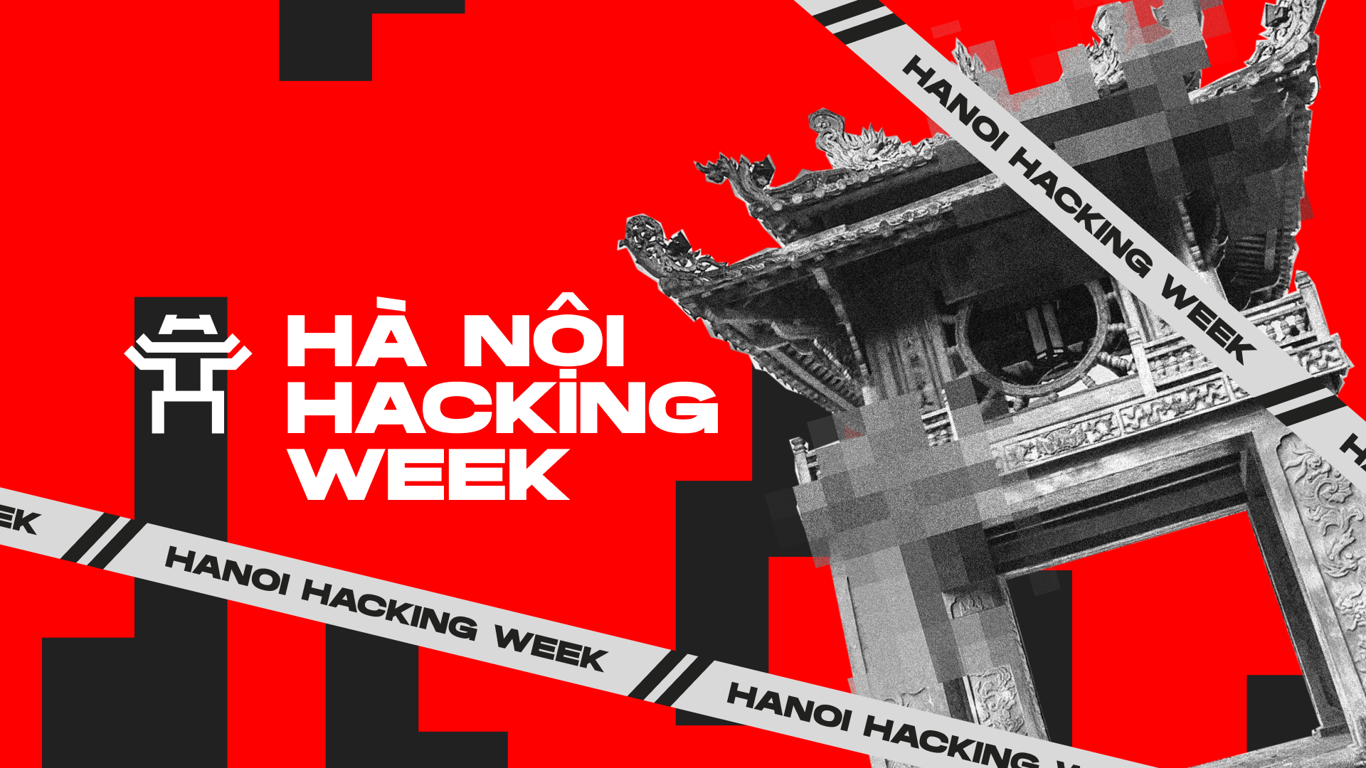
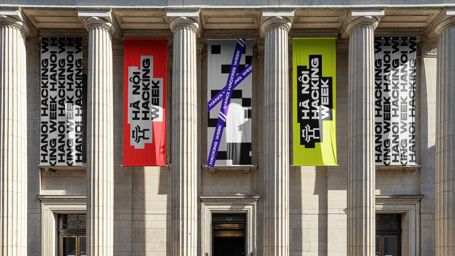
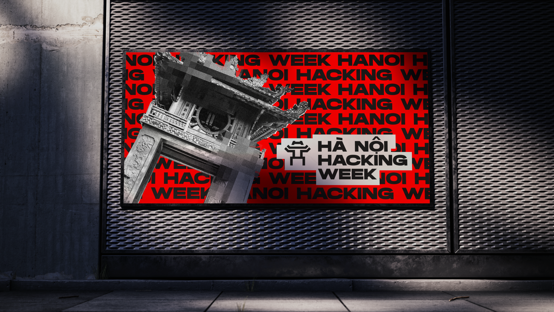
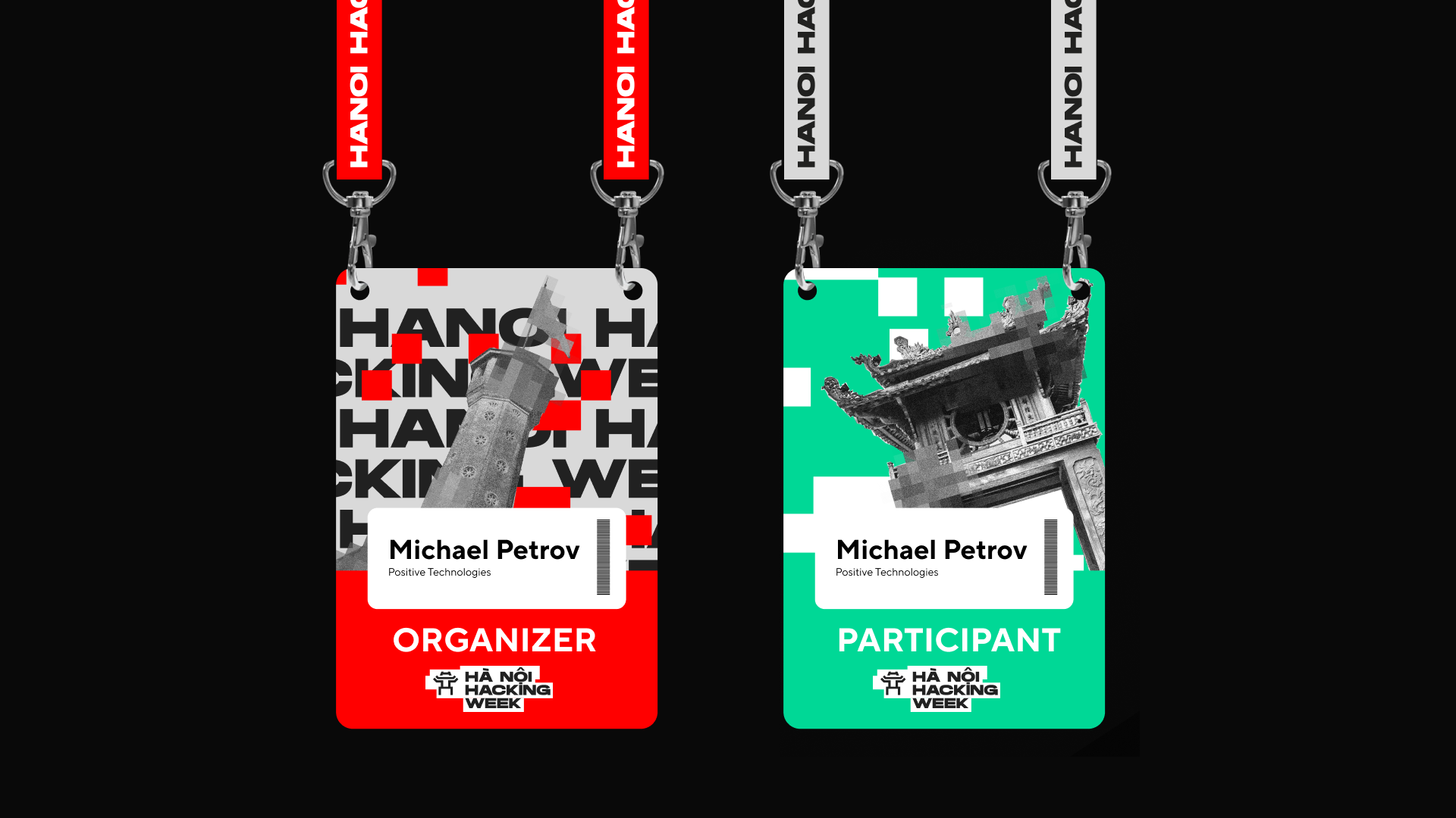
We began by drawing inspiration from Hanoi’s iconic landmarks, incorporating their photos into the design to create a strong sense of place. Bright ribbons were used as a central visual element, symbolizing connectivity, movement, and the flow of ideas. These ribbons intertwined with the landmarks, creating a lively and modern aesthetic.
The color palette was dominated by vibrant red and yellow, reflecting Vietnam’s national colors and evoking a sense of passion and energy. Additional bright colors were introduced to add depth and excitement, ensuring the design stood out in both digital and print formats.
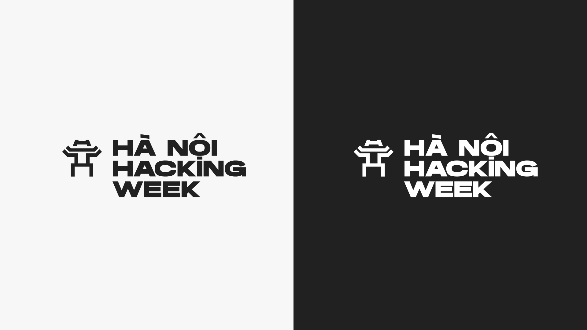
The logo featured a simple, bold typography paired with a decorative symbol representing Hanoi. This combination created a clean yet memorable mark that resonated with both local and international audiences.
The final brand identity successfully captured the spirit of Hanoi Hacking Week, blending cultural elements with a modern, tech-driven aesthetic. The vibrant colors, dynamic ribbons, and iconic imagery created a cohesive and impactful visual language that energized participants and strengthened the event’s identity.
Creative Director — Evgeny Brovkin
Art Director — Anton Kuzin
Designer — Elena Narendere